Frame 1: Title

 The font of our title was a very important task to us as it would be something that is synergised across all of our ancillary products. Therefore, we considered the connotations of many different fonts before finally settling on the font 'Charlemagne'. We initially started with the font 'Chiller' as we thought this was quite conventional of the thriller genre, whilst also connoting mystery and suspense. The font itself looks hand-written and messy, which suggests that the male antagonist could have wrote the word himself, giving off an eerie feel, due to his intimidating persona. However, after further research we found that this was not stereotypical of the thriller genre and was actually quite cliché as none of the films we researched used this sort of font in any of their products. Therefore, we decided to change our font to the 'Charlemagne' font as this was similar to other fonts we had seen such as in 'before I go to sleep'. This font is quite basic but also effective as it almost looks like a conventional font on a computer. This can be linked to our film, as in the trailer our male antagonist is seen to be stalking the female on social media, which is a common way for stalkers to access information on their 'victims', therefore amplifying the synergy of our film, whilst also being stereotypical of the thriller genre.
Frame 2: Storyline

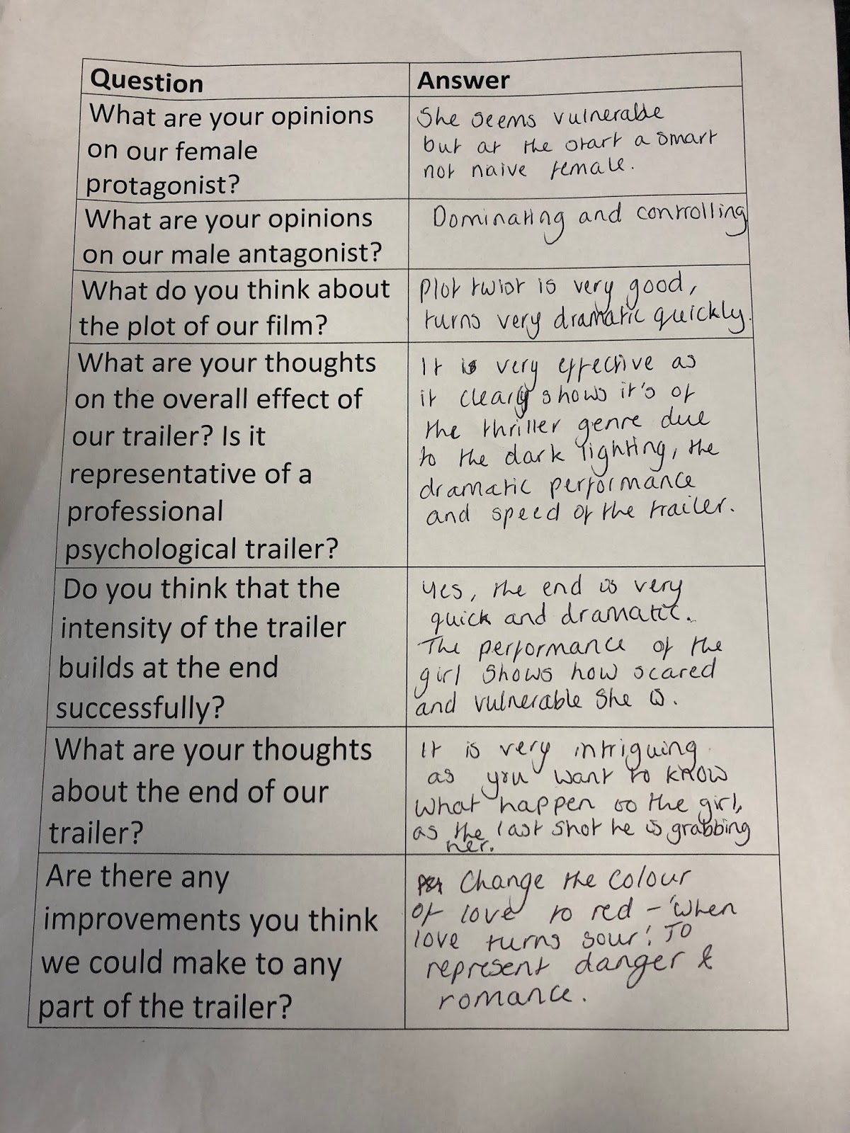
The storyline of our film has both very conventional aspects of a thriller film as well as some aspects that challenge these conventions. The start of our trailer could be considered unconventional as it has a heavy romantic tone at the start. Although this is not seen in many psychological thriller films, due to the popularity of a crime focus, it can be seen in the film 'Red Eye', where it was proposed to the audience that the characters meeting was accidental. We were inspired by the dramatic contrast between the opening and middle of the film (where the action occurs), which we felt effectively impacted the audience, leaving them on the edge of their seats. The stereotypical aspects in our storyline would be the way that we built tension throughout the trailer and the increasing violent actions of the male antagonist. It is common for thriller films to present violence, as this is a threatening notion which causes the audience to feel adrenaline and tension. Frame 2 is of the collage that the antagonist makes of the female protagonist in our film. This shows the increasingly obsessive nature of the antagonist, as he has multiple images of the female, whilst also knowing her address, place of work and also locations where she has been on holiday. This allows the audience to sympathise with the female protagonist as this is a threatening situation which could lead to potentially more dangerous situations. Our trailer also conforms to the convention of ending on a cliffhanger. This is because it entices the audience to come and see the film in order to find out what actual happens. The trailer end with an ambitious shot of a knife, which is a common prop used in thriller films such as 'The boy next door' and also a tussle between the two characters, where the film is left pinned against the wall by the male with his hand covering her mouth. This leaves the audience questioning what happens to the female?
Frame 3: Settings

In my trailer I used various locations in order to appeal to my young middle-class audience. These included a park, house and restaurant, which are typical locations that our target audience are likely to visit in their day-to-day lives. This allows our film to be more relatable to
our audience, allowing them to understand that they could just as easily be in this situation, increasing the frightening and 'thrilling' effect our trailer has. A home setting is used as this is commonly seen in thriller films such as 'The Purge'. This setting has connotations with security and comfort, therefore by expressing the fact that our female does not feel comfortable in her own home, makes the audience feel uncomfortable. The male is seen on many occasions to be hovering outside her house, taking pictures of her inside and also attempting to force entry into the house. This is an extremely frightening situation to be in and by making our film as relatable as possible, allows this fear to be expressed onto the audience also. Another setting used would be of a park. This usually has connotations of being a

family area and place of enjoyment. We conformed to these traditional connotations in order to further emphasise how 'in love' the characters are at the start of our trailer. This however, does challenge the stereotype of thriller films as, a park would commonly be used to express how much danger the character is in in an open space. This can be applied to our trailer in hindsight, as if the audience went back to these scenes after watching the whole film, they would understand that the female protagonist is in fact in danger without knowing it.
Frame 4: Props and costumes

In frame 4 I included a close up of one of our props - a knife. This is conforms to the conventions of the thriller genre as this is a threatening weapon commonly seen in thriller films, such as 'The boy next door'. Knives have connotations to murder, danger and violence, this is exactly the effect we were going for as we wanted to demonstrate the level of jeopardy the protagonist is in throughout the trailer. Other props we used in our trailer would include phones, cameras and laptops. These would not only attract our younger target audience as they are often known for being technological, but also present the way in which technology can be used negatively and cause distress among other people. The female is shown dialling 999 on her phone which perfectly presents her as being in a plead of desperation, which recurs throughout the trailer.
 Both the male and female are presented in casual clothing throughout my trailer as we wanted to emphasise the relatability of the characters and situation as much as possible in order to have the biggest impact on our audience. This is considered stereotypical for the female protagonist as she is often seen wearing feminine clothing such as a dressing gown and light coloured tops. The use of a dressing gown romanticises the character, which also puts her in a position of vulnerability as females are often known for being stereotypically 'weak'. This allows us to conform to the stereotype as it emphasises the fact that the female is a vulnerable victim, which is seen in many thriller films such as 'Taken'. This film opens with the daughter hiding under a bed in order to avoid being abducted by a group of men, which then proves to be unsuccessful. The male antagonist in our film however, challenges these stereotypical aspects of a male showing his power and dominance through his clothing (seen in the main personality of the character in Split), as our character wears casual clothing in order to emphasise the idea that he blends into society easily and is therefore unsuspected. We felt like the actions of the antagonist were violent and controlling enough that the clothes didn't need to reflect this also. However, due to the fact that my ancillary products only include a still image of the characters, I felt that it was necessary to place the male antagonist in a formal white shirt, in order to emphasise his domineering personality.
From our research we found that thriller trailers often used a wide variety of camera shots and angles in order to amplify the fast paced and chaotic effect of the editing. Before filming, we carefully planned out a storyboard with all the different shots we were planning to use. However, when we got to our first session of editing, we found that due to the fast paced nature of the trailer, we did not have enough shots. This meant that we had to go back to our storyboard and add in more shots that clearly sold the story to the audience whilst remaining true to a professional thriller trailer. We often used high angles on the female protagonist sitting on her bathroom floor as seen in frame 5. This emphasises her isolation and feelings of vulnerability and helplessness, which is a common way of presenting a female as the victim in thriller films. Besides this, we used close ups in order to focus on a specific object or facial expression, such as the close up of Selma dialling 999, which connotes desperation and also the close up of Lewis' eyes scanning his computer, amplifying his obsessive nature. POV shots were also common in our trailer as we felt that this allows the audience to connect more with our plot, putting them in the position of the male antagonist. This is most notable when Lewis is seen spying on the female outside her house and also the last shot of our trailer when the two characters are fighting. This is seen in various thriller films such as 'Girl on the Train' as it helps the audience relate to the characters, settings and also the situation the characters are in.
Fast paced editing is also used in our trailer, which is arguable the most conventional trait of thriller films. We challenged this at the start of the trailer as it begins quite slow paced, connoting a calm and romantic environment. This then builds throughout the rest of the trailer, being more stereotypical of the thriller genre. We matched the pace of the editing to the pace and beat of our music as this is often used in real thriller trailers, such as 'Gone Girl' as it increases the tension and suspense of the action shown. Non-chronological editing was also used in the editing of our trailer as this disorientates the audience and leaves them wondering in which order the action happens, which is typical of trailers as a whole.
Frame 6: Introducing characters

Our trailer only introduces 3 characters. These include the main female protagonist, the main male antagonist and the female's best friend. This is quite unconventional of thriller films as it is typical that a lot of characters are presented to the audience throughout. However, due to the complex nature of our narrative, we wanted to keep things simplistic by only focusing on the relationship between the two main characters. This focus allowed us to clearly demonstrate the increasingly violent and toxic relationship in order to have the most shocking impact on the audience. The trailer starts by introducing the characters as in love and happy within their relationship in order to emphasise the equilibrium and create a stark contrast between their relationship at the start and end of the trailer. This is further emphasised by the light hearted music and use of slow motion shots when Selma flicks her hair over her shoulders during a candle light dinner in order to romanticise her. The shots also take place in a park and restaurant which are relatable locations for our audience.
 Lewis (the male antagonist) is introduced as a caring and loving man at the start of our trailer which is not stereotypical of a male antagonist in most thriller films, enticing the audience to continue watching the trailer in order to find out how this relationship plays out. Our character then becomes more stereotypical as the trailer plays through, informing the audience of his controlling tendencies. Similar character traits can be seen in 'Split', when the main personality keeps the 3 girls locked in a room forcing them to do various things.
Selma is introduced in a similar way to Lewis, however continues to remain stereotypical throughout the rest of the trailer. A variety of high angle shots and close ups are used to emphasise her conventional vulnerability and weakness as she pleads helplessly for a way out of the relationship. This is similar to the female representation of 'Psycho' who is presented as vulnerable by being in the shower alone.
The best friend is briefly introduced to the audience at the start of the trailer. A mid shot is used as Selma is telling her how much she likes Lewis and believes he is the best for her. The best friend is presented as hope for Selma as she is the comforting figure, who will attempt to help Selma out of this difficult and dangerous situation. Although, she is only shown once in the trailer due to the fact we wanted to keep the audience about Selma's safety, in the film she would appear various times attempting to help.
Frame 7: Special effects

The first special effect we used would be the slow motion shots of Selma at the start of the trailer. The first one occurs when the two characters are sitting at a restaurant and Selma flicks her hair backwards. This romanticises her as a character which is a common feature of thriller trailers and links to the theory of Male Gaze. The male gaze refers to the act of depicting the world and women from a masculine and heterosexual point of view, presenting women as objects of male pleasure. The second use of slow motion would be when Selma is opening the door to Lewis's car after he offers her a lift. This is the last shot before the mood of the trailer changes and signifies the disequilibrium. The use of slow motion emphasises the start of dangerous events to come and amplifies the danger of the current situation she is in. Being in a small, enclosed environment with an obsession person is filled with jeopardy, causing the audience to have increased fear for the female character.
Another way we used special effects would be that we added a night vision effect to the camera shot as well as adding the typical camera grid and flashing record button. This enables the audience to understand that this shot is from the point of view of a camera, which increases the stalker effect.
The last use of special effects would be when we made the 'When love turns sour' inter title and 'Fixation' inter title appear word-by-word and letter-by-letter. Due to the fact Premier Pro did not have an option to do this, we had to create separate inter titles for each word/letter. We felt that this was an effective transition between the equilibrium and disequilibrium as it visually hints to the audience what is about to come. The use of this effect on our title at the end of our trailer was also effective as the letters appear in time with the beat of the music, leaving a lasting impact on the audience.


Frame 8: Film poster

 From my research I found that film posters often used close or mid shots of one or multiple characters. I also noticed that besides the fact the main image is centralised, there wasn't a set way to create a film poster, due to the variety of layouts. The layout of film posters often depended on the genre and plot line of the film, as there were usually direct links and hints between these in order to create synergy. I was heavily inspired by the film poster for 'Before I go to sleep' as I felt this was effective at introducing the characters and providing and insight to their personalities and situations. Using this poster as my inspiration I split my page into three sections in order to display three close up images of the characters. Due to the fact that my trailer only introduced 2 main characters, I decided to place the female protagonist in the middle with two images of the male antagonist either side. This has strong connotations to his controlling nature, as it suggests that he is always surrounding her and watching over her. I also put these images in black and white as I felt this emphasised his rigid, traditional (black and white) beliefs about the role of males and females in a patriarchal world. The centre image of the female is washed out in order to connote her helplessness. The eyes and lips of the character have been amplified so that they draw the audiences attention. I felt that it was very signified to increase the colour and brightness of her eyes as this emphasises the direct mode of address used by the characters in order to engage with the audience. I also included a slogan under neither the title "who do you trust?" as this is another use of direct mode of address. I placed the 'you' in red in order to capture the audience attention and instil a small amount of fear into them as it makes them question themselves who they do trust in real life, further increasing the relatability and therefore thrill of my film.
Whilst studying the 'Before I go to sleep' poster I also noticed that the characters names where above the images in white. I also used this layout, as although it is not a direct use of star power due to the fact I used uncommon actors, it filled the space above the images and provided a more balanced poster. I also placed the last names in red as this linked to other areas of the poster which are in the same colour and further suggested that the female is in danger and male is the cause of the danger.
 Other conventional aspects I included would be the use of a 5 star rating and release date. These are seen on almost film posters as it entices the audience to watch the film due to the trusted opinion of the review and also informs the audience of when they can watch the whole film. Overall I believe that all of these conventional features of my poster allow it to look like a professional film poster, which will effectively target my audience.
Frame 9: Magazine

 Whilst creating my own magazine front cover, I researched a lot of different issues created by well known companies such as Empire and Total Film. I made sure to take note on the layout, use of colour, and features included on it. Frame 9 includes a screenshot of the middle and bottom section of my cover, as it shows a wide variety of stereotypical conventions. This frame includes my main image which could be considered unconventional as it uses two people instead of one main one. Although this is not commonly used on film magazines, I did notice there was a couple that did. My justification for this was because I felt that this most effectively portrayed the personalities of my characters whilst also providing an insight into the plot. Other stereotypical conventions on my magazine would be the use of cover lines on both the left and right hand side of the page. This is used in order to promote my film by offering exclusive interviews and also other films of a similar genre in order to entice other audiences to watch my film. Other films are also advertise at the bottom of my page with two small pictures either side of my main image, which further targets other audiences who have an interest in the same genre as my film. The title of my film is in the largest font just below the middle of the page. The font is the same 'Charlemagne' font used across all 3 of my products amplifying the use of synergy. This was important as it allows the audience to not only identify the characters but also the style of font used for the title, increasing the memorability of my film as a whole. The colour scheme of my magazine is very stereotypical of the thriller genre. The main colours used include black, white and red which connote danger, mystery and potentially death, commonly seen in thriller films. In order to make my magazine look as realistic as possible I included all the necessary institutional information such as the price, barcode, date and issue number as well as puffs and plugs which appeal to the audience by offering exclusive things such as posters and premiere tickets.